Remember the early days of your school days, when having a 64-count box of Crayola crayons was the ultimate in creative freedom?
Okay, so as a designer in the digital age, you certainly don’t have to work with paints, inks, or other pigments, although we can learn color from a fine art approach. In fact, the human eye can see millions of different colors – but sometimes, choosing, or even just 2 or three, to use from these millions can seem like a daunting task.
This is because choosing colors for design is very subjective and, sometimes, highly scientific. So, where are the designers who just want a color palette that looks good or makes the client happy? Like it or not, the most effective color choices are more than personal preference, as color has an extraordinary ability to influence mood, emotion, and perception; take on cultural and personal meaning; and attract attention, whether consciously or subconsciously.
For designers and marketers, the challenge is balancing these complex roles that color plays to create an attractive, effective design. This is where a basic understanding of color theory can come in handy. Traditional color theory can help you understand which colors work well together (or not) and what effects different combinations will have in a design.
It all starts with the color wheel.
Basics: Understanding Color
color wheel
You may have seen it in a school art class, or at least be familiar with it in its stripped-down form: the primary colors of red, yellow, and blue. We will deal with the 12 traditional colors often used by painters and other artists. This is a simple visual way to understand color relationships.
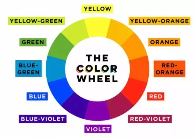
The color wheel is all about mixing colors. Mixing the primary colors, red, yellow and blue, you get the secondary colors of the color wheel: orange, green and violet. Combine those with a primary color and you get the third level of the color wheel, the tertiary color. These include red-orange, yellow-orange, chartreuse, blue-green, bluish-violet, and red-violet. The primary and secondary colors (with the additional blue) are part of the visible light spectrum, or the "colors of the rainbow," which many of you remember by the abbreviation "Roy. G BIV." As a child, remember these colors: red, orange, yellow, green, blue, indigo, and violet.
This way of understanding color is called a subtractive color model, which involves mixing color pigments in paints or inks – both traditional colors and printing equipment used fall within this category of the CMYK color system. This is opposed to the additive model, which involves mixing colored light (like the colors you see on your computer screen or TV) using a set of different primary colors: red, green, and blue, often abbreviated RGB.
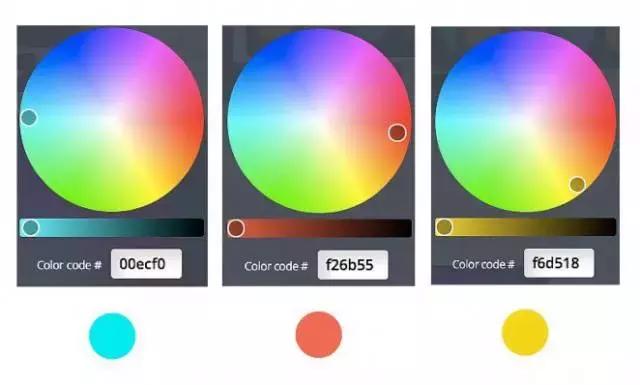
In the survey we have our own version of the colors that you can choose. Any color you choose will be determined by a hexadecimal value (or hex code), a six-digit number and/or letter combination (usually preceded by #) used in many design schemes to determine specific colors when designing web pages.
color words
Before we get into how to use the color wheel to create a color palette for your designs, let’s look at some color-related terms that will help you understand the different types of colors you might use in your work on design projects:
Hue: A synonym for "color" or a specific color, traditionally referring to one of the 12 colors on the color wheel
Color: black color
Color: Dull gray
Color: bright white color
Saturation: refers to the intensity or purity of a color (closer to a hue, closer to gray, more saturated)
Value: refers to the lightness or darkness of a color
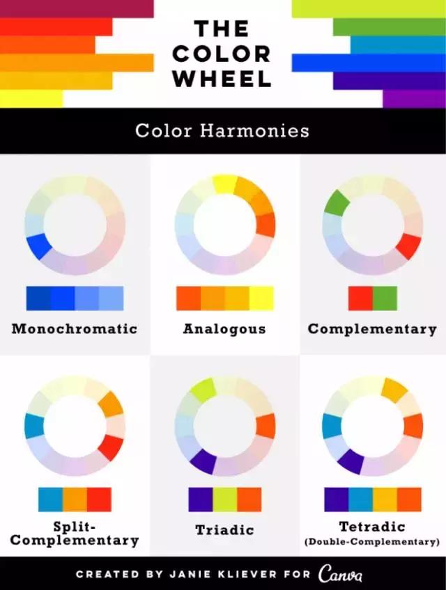
color harmony
Now that we've got the more technical stuff out of the way, let's look at how the color wheel can be a practical resource for choosing colors for design projects. We can think of some classic palettes as color wheels that painters have used for centuries to create balanced and visually pleasing (or high contrast and stunning) compositions. In most design applications, these color schemes need to be broken down into one dominant color, either because of how much it appears in the design, or because of how it compares to other colors – and one or more accent colors.
1) Monochrome: A variety of colors, tints, or tints of one color; for example, blues range from light to dark; this scheme is more subtle and conservative
2) Similar: Having a color on the color wheel, this type of scheme is versatile and easy to apply to design projects
3) Complementary: colors that are in opposite directions, like red/green or blue/orange; complementary colors are high contrast and high intensity, but can be difficult to apply in a balanced, harmonious way (especially in their purest form, when they can easily clash in a design)
4) Split Complementary: Two more flankers on the color wheel complement any color; this scheme still provides strong visual contrast, but is more harmonious than complementary color combinations
5) Three: Three, evenly spaced colors on the color wheel
6) Quad/Double Complementary: Two pairs of complementary colors; this scheme is very eye-catching, but may be more difficult to apply to a pair of complementary colors because the colors are more difficult to balance. If you use this type of plan, you'll want to choose one of four colors that are dominant and adjust the saturation/value/etc of some or all of the colors so they work well in different parts of the design, such as text and background.
color inspiration
In addition to the color combinations found in color combinations, nature offers endless inspiration for harmonious color schemes. For 25 great color palettes pulled from nature photography (and others inspired by travel, food and drink, and everyday items), check out another of our design school articles, “100 Gorgeous Color Combinations: How to Apply Them to Your Designs.”
Colors can also be paired with temperature (warm or cool colors), saturation (bright colors often look younger, while washed out looks), mood (bright and fun, dark and serious), theme (location, season, holiday), and other qualities. To explore different color schemes, check out one of the many color selection tools available online, some will even let you upload an image to generate a color scheme. Some attempts include paletton, Adobe CC (formerly known as Kuler Color), and colorexplorer. If you use a browser, you can download the Eyedropper extension, which allows you to identify and pull colors directly from the web.
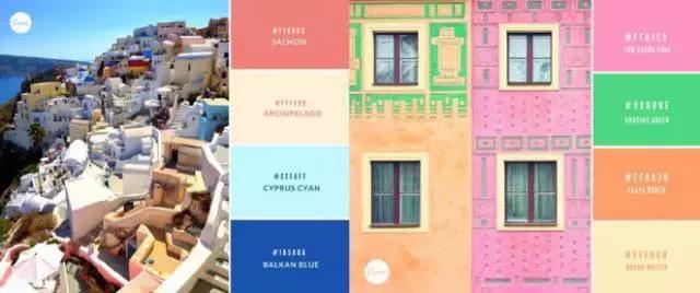
The bright, cheerful color palette is inspired by exotic travel locations.
Finding color inspiration from different historical periods and art movements can be another great technique. The palette below shows the warm, light-filled colors common to Impressionist paintings; the vivid, unexpected combinations used by Post-Impressionist painters; the soft, earthy colors characteristic of Art Nouveau; and the bright, bold colors of Pop Art.
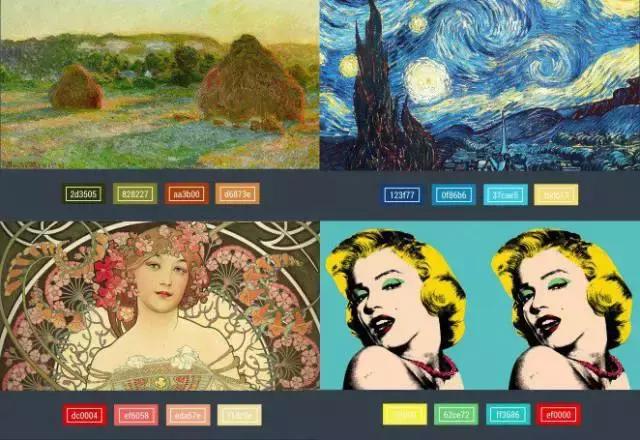
Left to right: “Wheatstacks (Late Summer)” by Claude Monet; “Starry Night” by Van Gogh; “Revelation” by Alphonse Mucha; “Marilyn” by Andy Warhol
color psychology
The colors around us. Whether we realize it or not, it plays an important role in our daily lives. That orange or yellow traffic sign you see on the road? This gets your attention. Do you buy a box of cereal at the market, even if it is a little more expensive than others? You may have been drawn to the color of its packaging. Color even creeps into language in creepy ways… Why do we say people "see red" when they're angry or "blue" when they're sad? Because color has a unique connection to our moods and emotions.
But not everyone thinks or experiences color in the same direction. The meanings and symbolism of the cultural and social groups we identify with and the different colors we associate with them are greatly affected. Let’s take a look at the basic colors in Western culture:
color symbolism
Red: This color can convey many different ideas depending on the context. Because red is associated with fire, it can represent warmth or danger. Since red is also the color of blood, it is considered an energy, lively color and is also associated with heart problems and sometimes violence.
Alternative meanings: In some Eastern cultures, red symbolizes good luck and prosperity and is the color worn by brides on their wedding day. Across the world, red has been associated with various political movements and symbolizes revolution.
In terms of branding: Red often conveys power, confidence, and power, and is a very visible color.
dribbble/studiojq
•Orange: Also a fiery color, orange hues, combined with communicative activities, can bring joy to yellow, warmth to red, and optimism. It is also associated with the harvest or autumn festival.

Dribbble/Mike Jones
Alternate meanings: In India, saffron, a certain shade of yellow-orange, is considered sacred. In Japan, orange is the color that symbolizes love.
Brand: Orange often represents youth and creativity. Gold, which is an orange or yellow color depending on its hue, is a symbol of luxury or high quality.
Dribbble/Bendidier
•Yellow: The color of sunlight, yellow often conveys happiness, joy, friendship, and the freshness of spring. It can also issue warnings or warnings in certain circumstances. Some variations (especially saturated yellows and greens) can look sick or unpleasant; historically, yellow was sometimes associated with disease quarantine.
Behance / ronggo wanggori
Alternative meanings: In some Eastern and Asian cultures, yellow is associated with royalty or high status. In parts of Africa and Latin America, yellow is the traditional color of mourning.
On branding: Solid/bright yellow work attracts attention but can be visually disturbing and even difficult to see (e.g. a bright yellow background or vice versa) if not used with care.
Green: This is the color of nature, plant life, growth. As such, it often conveys healthy, fresh, or "all natural" qualities. Dark green can represent wealth (or anything money related) and stability.
Alternative meanings: In the culture that practices Islam, green is a sacred color. Green is also associated with Ireland and, by extension, St. Patrick's Day and the lucky four-leaf clover.
Brands or products that want to be "green" (in the sense of natural, healthy, sustainable, eco-friendly, organic, etc.) often use nature-inspired colors such as green and brown.
Dribbble/Anna Hurley
Blue: The color of the sea and sky, blue often conveys peaceful, clean qualities. And more energetic, warmer and cooler, blue is seen as calming. In some cases, it can represent sadness or depression.
Dribbble/DI
Alternative meanings: In Middle Eastern cultures, blue has traditionally represented protection from evil. Because of its association with heaven, blue symbolizes immortality and/or spirituality in many cultures.
In Branding: Blue is one of the most widely used and versatile colors. Generally used to communicate integrity, security and stability. Dark or deep blue is an especially popular choice because of its corporate background and because it is believed to have serious, conservative, professional qualities.

Dribbble/Alibaba
Purple/Purple: Purple is often associated with royalty, majesty, or honor. It can also have spiritual, mystical or religious connotations.
Alternative meanings: In many cultures around the world, purple represents nobility or wealth; however, in Thailand and southern America, the color is associated with mourning.
Brand: Darker shades of purple also often symbolize luxury and affluence, while lighter/brighter shades can come across as feminine or childish.
BehanceHanoi/Nicholas
Black: Red, black has many (and sometimes opposing) meanings. It can represent power, luxury, sophistication, and exclusivity. On the other hand, it can symbolize death, evil, or mystery. In dress, black people generally wear either ceremonial ("black tie" for parties) or sad and sorrowful (as traditionally worn for funerals).
Alternative meanings: In some Asian and Latin American cultures, black is considered a masculine color. In Egypt, black represents rebirth. In many cultures, colors have magical powers, superstition, or bad luck, again, this is still unknown.
In terms of branding: black is so widely used that it’s almost a neutral, but it can still communicate more than its meaning depending on the context. Many designs are in black and white, either as a deliberate choice or simply to save money on color printing. Colors always look brighter and more strongly against black.

Dribbble/澾gjokaj
White: Due to the color of light and snow, white often represents purity, innocence, kindness, or perfection (and is traditionally worn by brides), but it can also be exactly as stark or sterile.
Alternative meaning: In China, white is the color of mourning. It represents peace in many cultures – a white flag is a universal symbol of truce or surrender.
In branding: White often conveys simplicity or clean, modern qualities. Designers seeking a minimalist aesthetic will often use lots of white.
color in design
Add a color scheme to your design rather than choosing two or three more shades to smash down in equal parts throughout your layout. Effectively applying color to a design project has a lot to do with balance and the colors you use, the more complicated it is to achieve balance.
An easy way to think about this concept is by splitting your color choices into dominant and accent colors. In your design, the dominant color will be the most obvious and most frequently used color, while one or more accent colors will complement and balance the main color. Paying attention to how the colors interact with each other in terms of contrast (or lack thereof), the readability of the text when it is referenced, how certain colors make others look when they are next to them, what kind of mood color combinations create, etc. – will help you fine-tune a perfect color palette for your design purposes.
Using a basic common rule of thumb in designing with three colors is called the 60-30-10 rule. This method is typically used in interior design, but can also be effectively applied to web or print design projects. You'll only make your dominant hue 60% of the color in the design, while bicolor colors use the remaining 30% and 10%. A good analogy to understand this piece is to depict a man's suit: the blazer and pants account for 60% of the outfit color; the shirt and tie account for 30%; provide a small pop of color at 10% – creating a balanced, polished look.
Another way to keep your palette simple and balanced is to use tints and tints (or dark versions of your chosen shades). This way, you can expand your color options without overwhelming your design with a rainbow of colors.
Dribbble/Seán Halpin
Color in marketing and branding
Brand identity is closely linked to color. Just think of Coca-Cola, Facebook, or Starbucks, and I bet you can immediately name the colors that those brands associate with.
A study by the University of Winnipeg, titled "The Impact of Color on Marketing," found that people's initial judgments about products are based on color (about 60 to 90% of evaluations – in just 90 seconds – are based on color). This means that in design, color is not only an artistic choice, but also an important business decision – influencing everything from consumer perceptions of a brand to product sales.
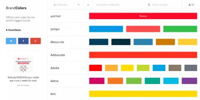
However, when choosing a color scheme for your logo or brand, you don't have to stick to any traditional symbols, or conventional methods. There are no foolproof processes or hard and fast rules when it comes to color. Most importantly, the color used in the design is a good fit for the brand's personality and market environment. For some inspiration, visit a website, brandcolors, that has compiled a visual guide (hex code) from well-known brand color choices from around the world.
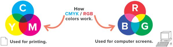
RGB and CMYK color systems
When you are working on a design that will be printed, your computer monitor will not be able to display the colors accurately as they will be seen on paper. "What you see is not what you get," because digital monitors/screens and printers use two different color systems: RGB and CMYK. RGB refers to the small dots of red, green, and blue light that form visible colors on the screen; while CMYK represents the color printing created by mixing cyan, magenta, yellow, and black inks on printing equipment. Since the RGB color space uses other colors than CMYK, it is worth noting that some designers prefer to initially create print projects in RGB for more color options and then transfer the design into the finished product before printing in CMYK.
Because of these differences, designers need a way to get consistent color results when working with both systems – for example, if you're designing a logo for your website but also want to get a business card printed. This is where the Pantone Color Matching System (or systems) can help. Colors can be matched to web and print (as well as different types of printing surfaces) to ensure a unified look. The Pantone system makes it easy for designers, clients, and printers to collaborate to ensure the final product looks as intended.
Color: understand it, explore it and love it!